https://css-tricks.com/complete-guide-to-css-functions/
Like any other programming language, CSS has functions. They can be inserted where you’d place a value, or in some cases, accompanying another value declaration. Some CSS functions even let you nest other functions within them!
More
In programming, functions are a named portion of code that performs a specific task. An example of this could be a function written in JavaScript called sayWoof():
We can use this function later in our code, after we have defined our desired behavior. For this example, any time you type sayWoof() in your website or web app’s JavaScript it will print “Woof!” into the browser’s console.
Functions can also use arguments, which are slots for things like numbers or bits of text that you can feed into the function’s logic to have it modify them. It works like this in JavaScript:
Here, we have a function called countDogs() that has an argument called amount. When a number is provided for amount, it will take that number and add it to a pre-specified sentence. This lets us create sentences that tell us how many dogs we’ve counted.
Some programming languages come with baked-in functions to help prevent you from having to reinvent the wheel for every new project. Typically, these functions are built to help make working with the main strengths and features of the language easier.
Take libraries, for example. Libraries are collections of opinionated code made to help make development faster and easier, effectively just curated function collections — think FitVids.js for creating flexible video elements.
Basics of CSS Functions

Unlike other programming languages, we cannot create our own functions in CSS, per se. That kind of logic is reserved for CSS selectors, which allow you to create powerful conditional styling rules.
As opposed to other programming languages — where the output of a function typically invisibly affects other logic down the line — the output of CSS functions are visual in nature. This output is used to control both layout and presentation of content. For example:
.has-orange-glow {
  filter: drop-shadow(0.25rem 0 0.75rem #ef9035);
}
The CSS filter function drop-shadow() uses the arguments we provide it to create an orange outer glow effect on whatever it is applied to.
In the following demo, I have a JavaScript function named toggleOrangeGlow that toggles the application of the class .has-orange-glow on the CSS-Tricks logo. Combining this with a CSS transition, we’re able to create a cool glowing effect:
You may be familiar with some CSS functions, but the language has a surprisingly expansive list!
Much like any other technology on the web, different CSS functions have different levels of browser support. Make sure you research and test to ensure your experience works for everyone, and use things like @supports to provide quality alternate experiences.
Common CSS Functions
url()
.el {
  background: url(/images/image.jpg);
}
Using url()
attr()
/* <div data-example="foo"> */
div {
  content: attr(data-example);
}
Using attr()
calc()
.el {
  width: calc(100vw - 80px);
}
Using calc()
lang()
p:lang(en) {
  quotes: "\201C" "\201D" "\2018" "\2019" "\201C" "\201D" "\2018" "\2019";
}
Using lang()
:not()
h3:not(:first-child) {
  margin-top: 0;
}
Using :not()
CSS Custom Properties
There is only one function specific to CSS custom properties, but it makes the whole thing tick!
Thevar() function is used to reference a custom property declared earlier in the document.
html {
  --color: orange;
}

p {
  color: var(--color);
}
It is incredibly powerful when combined with calc().
html {
  --scale: 1.2;
  --size: 0.8rem;
}

.size-2 {
  font-size: calc(var(--size) * var(--scale));
}
.size-2 {
  font-size: calc(var(--size) * var(--scale) * var(--scale));
}
More about using var()
Color Functions
Another common place you see CSS functions is when working with color.
rgb() and rgba()
.el {
  color: rgb(255, 0, 0);
  color: rgba(255, 0, 0, 0.5);
  color: rgb(255 0 0 / 0.5);
}
Using rgb()
hsl() and hsla()
.el {
  background: hsl(100, 100%, 50%);
  background: hsla(100, 100%, 50%, 0.5);
  background: hsl(100 100% 50% / 0.5);
}
More about using hsl()
New Color Functions
In the upcoming CSS Color Module Level 4 spec, we can ignore the a portion of rgba() and hsla(), as well as the commas. Now, spaces are used to separate the rgb and hsl arguments, with an optional / to indicate an alpha level.
We’ll also start seeing new functions like lab() and lch() that will use this new format
Pseudo Class Selector Functions
These selectors use specialized argument notation that specifies patterns of what to select. This allows you to do things like select every other element, every fifth element, every third element after the seventh element, etc.
Pseudo class selectors are incredibly versatile, yet often overlooked and under-appreciated. Many times, a thoughtful application of a few of these selectors can do the work of one or more node packages.
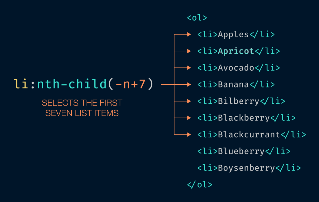
:nth-child()
.el:nth-child(3n) {
  background-color: #eee;
}
nth-child() allows you to target one or more of the elements present in a group of elements that are on the same level in the Document Object Model (DOM) tree.

In the right hands, :nth-child() is incredibly powerful. You can even solve fizzbuzz with it! If you’re looking for a good way to get started, Chris has a collection useful pseudo selector recipes.
:nth-last-child()
.el:nth-last-child(2) {
  opacity: 0.75;
}
.el:last-child {
  opacity: 0.5;
}
This pseudo class selector targets elements in a group of one or more elements that are on the same level in the DOM. It starts counting from the last element in the group and works backwards through the list of available DOM nodes.
:nth-of-type()
h2:nth-of-type(odd) {
  text-indent: 3rem;
}
:nth-of-type() matches a specified collection of elements of a given type. For example, a declaration of img:nth-of-type(5) would target the fifth image on a page.
:nth-last-of-type()
section:nth-last-of-type(3) {
  background-color: darkorchid;
}
This pseudo class selector can target an element in a group of elements of a similar type. Much like :nth-last-child(), it starts counting from the last element in the group. Unlike :nth-last-child, it will skip elements that don’t apply as it works backwards.
Animation Functions
Animation is an important part of adding that certain je ne sais quoi to your website or web app. Just remember to put your users’ needs first and honor their animation preferences.
Creating animations also requires controlling the state of things over time, so functions are a natural fit for making that happen.
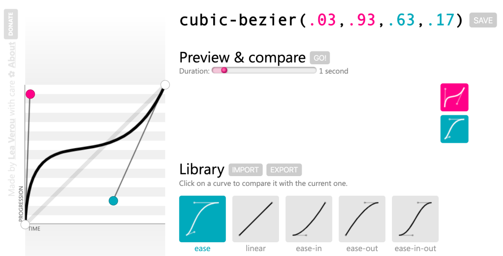
cubic-bezier()
.el {
  transition-timing-function:
    cubic-bezier(0.17, 0.67, 0.83, 0.67);
}
Instead of keyword values like ease, ease-in-out, or linear, you can use cubic-bezier() to create a custom timing function for your animation. While you can read about the math that powers cubic beziers, I think it’s much more fun to play around with making one instead.
path()
.clip-me {
  clip-path: path('M0.5,1 C0.5,1,0,0.7,0,0.3 A0.25,0.25,1,1,1,0.5,0.3 A0.25,0.25,1,1,1,1,0.3 C1,0.7,0.5,1,0.5,1 Z');
}
.move-me {
  offset-path: path("M56.06,227 ...");
}
This function is paired with the offset-path property (or eventually, the clip-path property). It allows you to “draw” a SVG path that other elements can be animated to follow.
Both Michelle Barker and Dan Wilson have published excellent articles that go into more detail about this approach to animation.
steps()
.el {
  animation: 2s infinite alternate steps(10);
}
This relatively new function allows you to set the easing timing across an animation, which allows for a greater degree of control over what part of the animation occurs when. Dan Wilson has another excellent writeup of how it fits into the existing animation easing landscape.
Sizing & Scaling (Transform) Functions
One common thing we do with animation is stretch and squash stuff. The following functions allow you to do exactly that. There is a catch, however: These CSS functions are a special subset, in that they can only work with the transform property.
scaleX(), scaleY(), scaleZ(), scale3d(), and scale()
.double {
  transform: scale(2);
}
Scaling functions let you increase or decrease the size of something along one or more axes. If you use scale3d() you can even do this in three dimensions!
translateX(), translateY(), translateZ(), translate3d(), and translate()
.center {
  position: absolute;
  top: 50%;
  left: 50%;
  transform: translate(-50%, -50%);
}
Translate functions let you reposition an element along one or more axes. Much like scale functions, you can also extend this manipulation into three dimensions.
perspective()
.cube {
  transform: perspective(50em) rotateY(50deg)
}
This function lets you adjust the appearance of an object to make it look like it is projecting up and out from its background.
rotateX(), rotateY(), rotateZ(), rotate3d(), and rotate()
.avatar {
  transform: rotate(25deg);
}
Rotate functions let you swivel an element along one or more axes, much like grasping a ball and turning it around in your hand.
skewX(), skewY(), and skew()
.header {
  transform: skew(25deg, 15deg);
}
Skew functions are a little different from scaling and rotation functions in that they apply a distortion effect relative to a single point. The amount of distortion is proportionate to the angle and distance declared, meaning that the further the effect continues in a direction the more pronounced it will be.
Jorge Moreno also did us all a favor and made a great tool called CSS Transform Functions Visualizer. It allows you to adjust sizing and scaling in real time to better understand how all these functions work together:
As responsible web professionals, we should be mindful of our users and the fact that they may not be using new or powerful hardware to view our content. Large and complicated animations may slow down the experience, or even cause the browser to crash in extreme scenarios.
To prevent this, we can use techniques like will-change to prepare the browser for what’s in store, and the update media feature to remove animation on devices that do not support a fast refresh rate.
https://css-tricks.com/complete-guide-to-css-functions/
Common CSS Functions
url()
.el {
  background: url(/images/image.jpg);
}
Using url()
attr()
/* <div data-example="foo"> */
div {
  content: attr(data-example);
}
Using attr()
calc()
.el {
  width: calc(100vw - 80px);
}
Using calc()
lang()
p:lang(en) {
  quotes: "\201C" "\201D" "\2018" "\2019" "\201C" "\201D" "\2018" "\2019";
}
Using lang()
:not()
h3:not(:first-child) {
  margin-top: 0;
}
Using :not()
CSS Custom Properties
There is only one function specific to CSS custom properties, but it makes the whole thing tick!
Thevar() function is used to reference a custom property declared earlier in the document.
html {
  --color: orange;
}

p {
  color: var(--color);
}
It is incredibly powerful when combined with calc().
html {
  --scale: 1.2;
  --size: 0.8rem;
}

.size-2 {
  font-size: calc(var(--size) * var(--scale));
}
.size-2 {
  font-size: calc(var(--size) * var(--scale) * var(--scale));
}
More about using var()
Color Functions
Another common place you see CSS functions is when working with color.
rgb() and rgba()
.el {
  color: rgb(255, 0, 0);
  color: rgba(255, 0, 0, 0.5);
  color: rgb(255 0 0 / 0.5);
}
Using rgb()
hsl() and hsla()
.el {
  background: hsl(100, 100%, 50%);
  background: hsla(100, 100%, 50%, 0.5);
  background: hsl(100 100% 50% / 0.5);
}
More about using hsl()
New Color Functions
In the upcoming CSS Color Module Level 4 spec, we can ignore the a portion of rgba() and hsla(), as well as the commas. Now, spaces are used to separate the rgb and hsl arguments, with an optional / to indicate an alpha level.
We’ll also start seeing new functions like lab() and lch() that will use this new format
Pseudo Class Selector Functions
These selectors use specialized argument notation that specifies patterns of what to select. This allows you to do things like select every other element, every fifth element, every third element after the seventh element, etc.
Pseudo class selectors are incredibly versatile, yet often overlooked and under-appreciated. Many times, a thoughtful application of a few of these selectors can do the work of one or more node packages.
:nth-child()
.el:nth-child(3n) {
  background-color: #eee;
}
nth-child() allows you to target one or more of the elements present in a group of elements that are on the same level in the Document Object Model (DOM) tree.
In the right hands, :nth-child() is incredibly powerful. You can even solve fizzbuzz with it! If you’re looking for a good way to get started, Chris has a collection useful pseudo selector recipes.
:nth-last-child()
.el:nth-last-child(2) {
  opacity: 0.75;
}
.el:last-child {
  opacity: 0.5;
}
This pseudo class selector targets elements in a group of one or more elements that are on the same level in the DOM. It starts counting from the last element in the group and works backwards through the list of available DOM nodes.
:nth-of-type()
h2:nth-of-type(odd) {
  text-indent: 3rem;
}
:nth-of-type() matches a specified collection of elements of a given type. For example, a declaration of img:nth-of-type(5) would target the fifth image on a page.
:nth-last-of-type()
section:nth-last-of-type(3) {
  background-color: darkorchid;
}
This pseudo class selector can target an element in a group of elements of a similar type. Much like :nth-last-child(), it starts counting from the last element in the group. Unlike :nth-last-child, it will skip elements that don’t apply as it works backwards.
Animation Functions
Animation is an important part of adding that certain je ne sais quoi to your website or web app. Just remember to put your users’ needs first and honor their animation preferences.
Creating animations also requires controlling the state of things over time, so functions are a natural fit for making that happen.
cubic-bezier()
.el {
  transition-timing-function:
    cubic-bezier(0.17, 0.67, 0.83, 0.67);
}
Instead of keyword values like ease, ease-in-out, or linear, you can use cubic-bezier() to create a custom timing function for your animation. While you can read about the math that powers cubic beziers, I think it’s much more fun to play around with making one instead.

path()
.clip-me {
  clip-path: path('M0.5,1 C0.5,1,0,0.7,0,0.3 A0.25,0.25,1,1,1,0.5,0.3 A0.25,0.25,1,1,1,1,0.3 C1,0.7,0.5,1,0.5,1 Z');
}
.move-me {
  offset-path: path("M56.06,227 ...");
}
This function is paired with the offset-path property (or eventually, the clip-path property). It allows you to “draw” a SVG path that other elements can be animated to follow.
Both Michelle Barker and Dan Wilson have published excellent articles that go into more detail about this approach to animation.
steps()
.el {
  animation: 2s infinite alternate steps(10);
}
This relatively new function allows you to set the easing timing across an animation, which allows for a greater degree of control over what part of the animation occurs when. Dan Wilson has another excellent writeup of how it fits into the existing animation easing landscape.